In this article
Every building exists twice before it is built. First as an idea, loose enough to hold contradictions: heavy and light, open and private, bold and calm. Then as an image precise enough to stand up in a client meeting. The distance between those two states is where most design decisions are really made, yet it is rarely shown. This villa is a useful case study because both stages survive side by side: the first hand sketch and the final visualization.
The brief: a house on a corner
The site sits on a street corner, with two public frontages, mature trees on either side and a city skyline beyond. That single fact shaped the brief before any material was chosen. A corner house is seen from two directions at once. It needs a strong, clear presence on both streets, without reading as two separate facades joined together.
Corner plots are also harder than they look. Two frontages mean two audiences, two sun exposures and no hidden “back” for the practical parts of a home. Left unresolved, the result is often a symmetrical box with matching windows on both sides, where privacy is quietly sacrificed for a tidy elevation. The second challenge was scale: a two-story house on an open corner can easily feel either too small for its street or too heavy for it.
The first sketch
The design began on paper. The first sketch is quick and loose, but it already contains the three decisions that carried the project through to the end: a projecting upper volume reaching toward the corner, a solid element anchoring the point where the two streets meet, and a stepped, planted edge between the pavement and the front door.
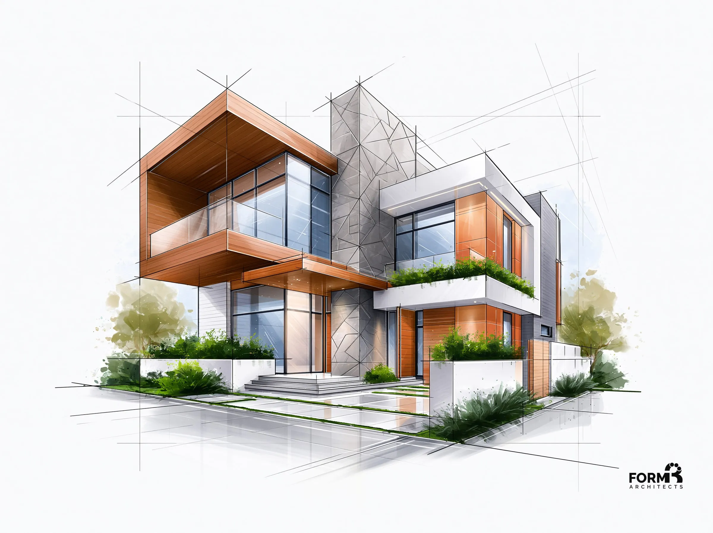
Sketching first matters. It keeps the conversation on proportion, light and movement, the things that make or break a house, before any time is spent on detailed modeling.
Three design moves
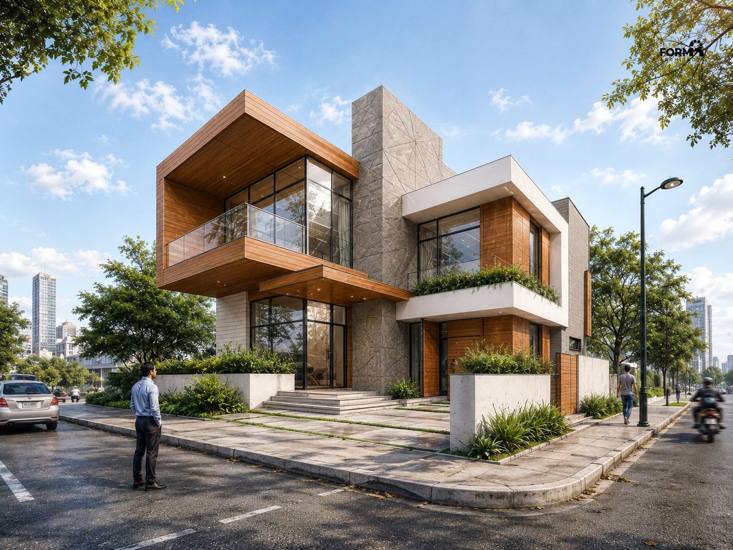
A cantilever that does real work. The upper floor, clad in warm horizontal timber, projects toward the corner and floats above a fully glazed ground floor. It is not decoration. The overhang shades the glass, shelters the entrance and creates a covered outdoor room at street level, so the corner feels lived in rather than blank. Glass balustrades on the upper terrace stop the timber volume from feeling solid and heavy.
A stone wall as a hinge. At the pivot between the two frontages stands a vertical stone wall with an angular, faceted surface. It gives the composition a fixed point of weight, so the cantilever reads as a confident projection rather than an unsupported overhang. The rest of the house seems to turn around it.
Privacy through landscape, not fences. Stepped stone terraces, layered planting and shallow water separate the public pavement from the private entrance. The house stays open and welcoming to the street, while the landscape quietly filters views and slows the approach.
A restrained material palette
Only three main materials carry the design: warm timber on the cantilevered volume, a light textured stone on the anchor wall, and smooth white render elsewhere. Full-height glazing sits beneath the cantilever in slim dark frames, and concrete paving with grass joints carries the same language into the garden. Keeping the palette short lets the form do the talking and ages gracefully.
From sketch to 3D
The sketch was first tested as a simple massing model in SketchUp to check proportions from both streets and the depth of the overhang. The design was then developed in 3ds Max, with the facade, terraces and landscape modeled in detail, and lit and rendered in Corona to study late-afternoon sun on the timber and stone. Final images were refined in Photoshop, with AI-assisted tools used during post-production to explore atmosphere and planting.
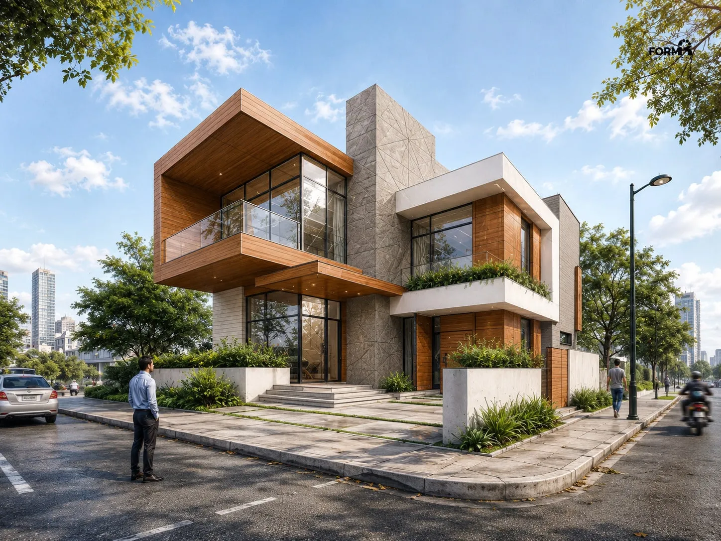
Comparing the two images shows what the visualization added and what it kept. The render confirmed the key ideas from the sketch, while revealing details the sketch could only suggest: how deep the shade under the cantilever feels, how the stone catches low light, and how the planting softens the corner at eye level.
What this project shows
- A strong first idea is worth protecting. The cantilever, the stone hinge and the landscape threshold all survived from the first sketch to the final image.
- On a corner plot, one clear gesture works better than two competing facades.
- Visualization is not only about making a project look good. It is a design tool that tests light, scale and materials before anything is built.
If you are planning a house on a challenging plot, or need photorealistic visualization to present a design, you can get in touch here. You can also see more of my architectural design projects.
Tags
Share